In today’s digital world, users access websites from a wide range of devices, including smartphones, tablets, laptops, and desktops. With this diversity in screen sizes and resolutions, having a responsive website is no longer optional—it is essential. Responsive web design ensures that your website adapts seamlessly to different devices, providing an optimal user experience regardless of how it is accessed.
This blog explores the importance of responsive web design and why it is critical for modern businesses.
What is Responsive Web Design?
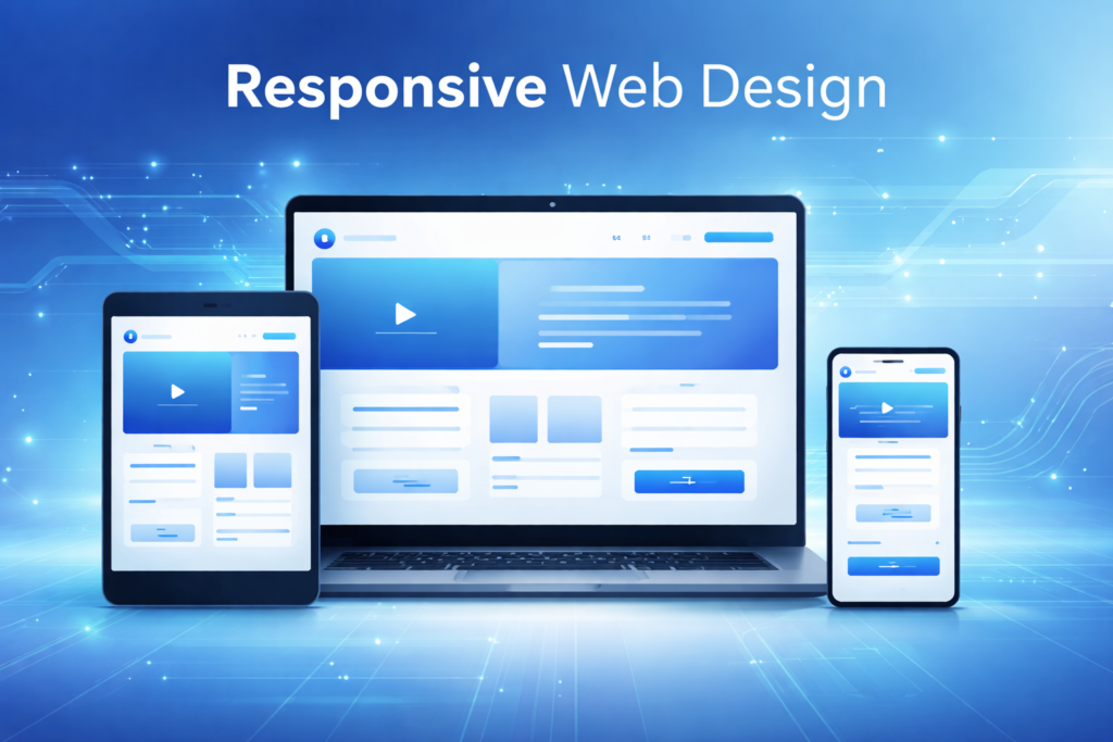
Responsive web design is an approach to web development that allows a website to automatically adjust its layout, images, and content based on the user’s screen size and device type. Instead of creating separate versions of a website for mobile and desktop, responsive design uses flexible layouts and media queries to deliver a consistent experience across all devices.
Enhances User Experience
User experience is one of the most important factors for any website. A responsive design ensures that users can easily navigate, read content, and interact with your site without zooming or scrolling excessively.
Benefits:
- Easy navigation on all devices
- Improved readability
- Better interaction with buttons and forms
A positive user experience keeps visitors engaged and encourages them to explore your website further.
Improves Mobile Traffic
With the majority of internet users browsing on mobile devices, responsive design plays a key role in capturing mobile traffic.
Why It Matters:
- Mobile users expect fast and smooth experiences
- Non-responsive websites often lead to high bounce rates
- Better usability increases time spent on site
By optimizing for mobile, businesses can reach a larger audience and increase engagement.
Boosts SEO Rankings
Search engines like Google prioritize mobile-friendly websites in their rankings. Responsive web design is a key factor in SEO.
SEO Benefits:
- Improved mobile-first indexing
- Reduced bounce rate
- Faster loading times
- Better user engagement metrics
A responsive website increases your chances of ranking higher in search results.
Cost-Effective and Easy to Maintain
Maintaining separate websites for desktop and mobile can be expensive and time-consuming. Responsive design eliminates the need for multiple versions.
Advantages:
- Single website for all devices
- Lower development and maintenance costs
- Easier updates and content management
This makes responsive design a cost-effective solution for businesses.
Increases Conversion Rates
A seamless user experience across devices directly impacts conversion rates. If users can easily navigate your website, they are more likely to take action.
Examples:
- Completing a purchase
- Filling out a contact form
- Signing up for a newsletter
Responsive design removes barriers, making it easier for users to convert.
Faster Website Loading Speed
Responsive websites are optimized for performance, ensuring faster loading times across devices.
Optimization Techniques:
- Flexible images
- Efficient coding practices
- Mobile-first design
Faster websites not only improve user experience but also contribute to better SEO rankings.
Builds Brand Credibility
A well-designed responsive website reflects professionalism and reliability.
Impact on Branding:
- Consistent design across devices
- Improved user trust
- Better first impressions
Users are more likely to trust and engage with a brand that offers a smooth and modern browsing experience.
Supports Multi-Device Users
Many users switch between devices during their browsing journey. For example, they may start browsing on a mobile device and complete a purchase on a desktop.
Responsive design ensures a consistent experience across all touchpoints, improving user satisfaction and retention.
Adapts to Future Devices
Technology is constantly evolving, with new devices and screen sizes emerging regularly. Responsive design ensures your website remains adaptable to future devices without requiring major changes.
This future-proof approach helps businesses stay relevant in a rapidly changing digital landscape.
Key Elements of Responsive Design
To implement responsive web design effectively, consider the following elements:
- Fluid Grid Layouts: Flexible layouts that adjust based on screen size
- Flexible Images: Images that scale within their containers
- Media Queries: CSS techniques to apply styles based on device characteristics
- Mobile-First Approach: Designing for smaller screens first
These elements work together to create a seamless experience across devices.
Common Mistakes to Avoid
- Ignoring mobile users
- Using fixed-width layouts
- Not testing on multiple devices
- Overloading pages with heavy elements
- Poor navigation on smaller screens
Avoiding these mistakes ensures a smooth and effective responsive design.
Conclusion
Responsive web design is a critical component of modern web development. It enhances user experience, improves SEO rankings, increases conversions, and ensures your website remains accessible across all devices.
In a world where users expect fast, seamless, and consistent experiences, responsive design is no longer a luxury it is a necessity. By investing in responsive web design, businesses can create a strong online presence and stay ahead of the competition.